
Dining Room Color Ideas That Change Food Flavor
Have you ever noticed how you can sit in a cozy Italian restaurant for hours, talking and enjoying every single bite? But at home, do you just rush through your dinner because the room feels boring or cold?
It’s not just about the secret ingredients in the food. The real secret is hidden in the colors of the walls, the lighting, and the textures around you!
Welcome to the world of appetite design. This is a cool mix of brain science and home decor. By using specific appetite stimulating dining room colors and avoiding the wrong ones, you can actually trick your brain into making your food taste better.
Here is how you can use positive design tricks—and avoid negative mistakes—to turn every meal into a super delicious experience.
Why Colors Matter: The Secret Connection to Our Brain
Our love for colors and food goes back thousands of years. Early humans used colors to check if a fruit was ripe and sweet (Positive Sentiment) or rotten and dangerous (Negative Sentiment). Warm colors meant good energy, while cool colors usually meant danger, mold, or poison.
Today, when we look at certain colors, our brain reacts instantly. It can speed up our heartbeat or make our mouth water before we even take a single bite of our food. This is exactly how dining room color psychology works.
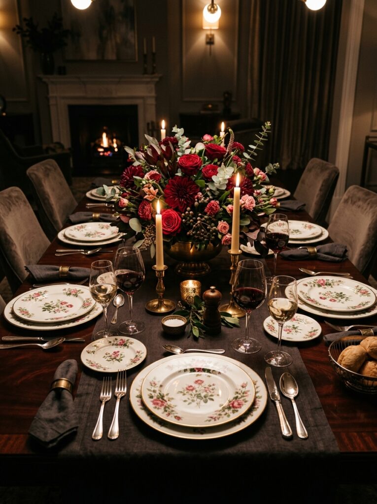
1. The Positive Power of Red: The Hunger Booster
There is a big reason why famous fast-food chains and expensive restaurants use red in their logos and dining areas. Red is the king of hunger!
Looking at Red ➔ Faster Heartbeat ➔ Metabolism Speeds Up ➔ Your Mouth Waters!
When your brain sees red, it gets a little excited. This positive excitement speeds up your metabolism and makes you feel genuinely hungry.
How to Use It at Home (Without It Looking Cheap)
You don’t want your dining room to look like a messy fast-food joint. So, skip the bright, flashy reds. Instead, use these classy shades:
- Burgundy or Maroon: These dark, rich colors look beautiful on a main wall or on upholstered dining chairs.
- Terracotta or Rust: These warm, earthy tones give you all the hunger benefits of red but feel super cozy, natural, and welcoming.
2. Orange and Yellow: Joyful and Social Tones
If red is the color of hunger, orange and yellow are the colors of happy, positive conversations.
Orange relaxes people and helps them talk more. When you are happy and chatting, you naturally eat slower and enjoy the flavors of your food much more. Yellow brings a positive feeling of sunshine and optimism. A happy brain is always more ready to enjoy a good meal!
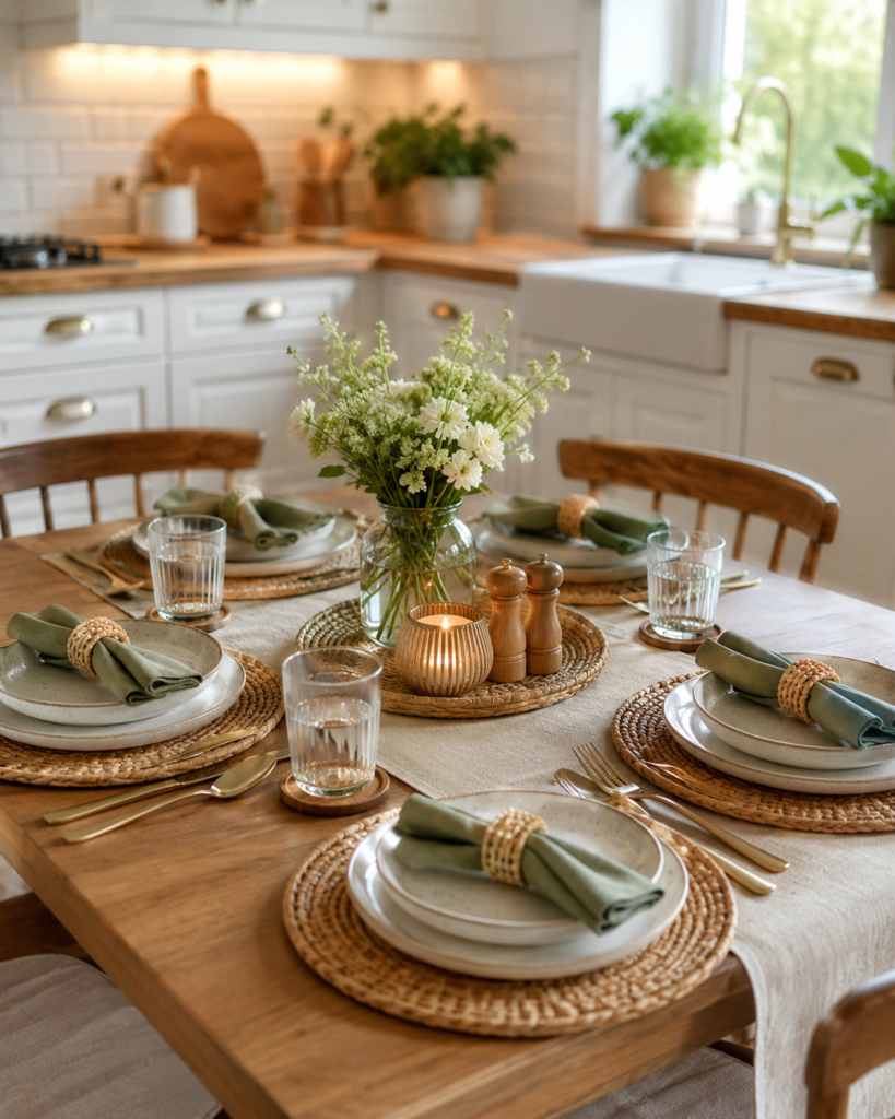
A Simple Design Hack
Don’t paint all four walls bright yellow or orange—that will hurt your eyes and create a negative, stressful feeling. Instead, use them in small, smart ways:
- Put a yellow vase or amber-colored glasses on the table.
- Use warm orange or terracotta seat cushions.
3. The Negative Impact of Blue: The Diet Trap
If you want your family to enjoy their food, keep standard blue away from the dining table. Blue has a very negative effect on hunger.
Think about it: how many natural foods are blue? Almost none! Because of this, our brain views blue as a sign of danger, bad taste, or diet food. Blue actually stops you from feeling hungry. If you paint your dining room a cold, bright blue, your guests might feel uninspired to finish their plates.
However, there is a big, positive exception to this cool-color rule: Sage Green and Olive Green.
Earthy Green ➔ Feels Fresh ➔ Feels Healthy ➔ Makes Food Look Clean and Organic
Soft, earthy greens don’t stop your hunger. Instead, they make your dining room feel like a fresh, high-quality restaurant. It’s perfect if you love serving fresh, healthy home-cooked meals.
4. White, Beige, and Cream: The Peaceful Canvas
Many modern homes use white or beige for a clean look. While these colors don’t directly make you hungry, they have a very peaceful and positive vibe. They act like a blank canvas.
When your walls are a soft cream or warm beige, the focus goes 100% onto the food. The colorful vegetables, the golden rice, or the rich brown gravy will pop out and look incredibly delicious against a neutral background.
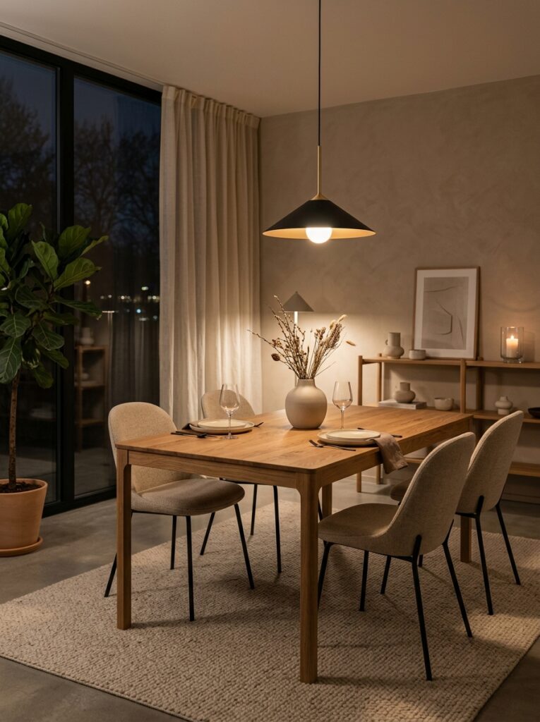
Touch and Feel: Why Textures Matter
Colors start the hunger, but textures in interior design decide how long you want to sit at the table.
If your dining room feels cold, hard, and metallic (Negative Feel), your brain stays alert and stressed. You will end up eating too fast just to leave the uncomfortable room. To make your meals feel luxurious, you need to add soft and natural textures (Positive Feel) that help your body relax.
| Material / Texture | How It Feels (Sentiment) | Where to Use It |
| Natural Wood | Warm, friendly, and grounded (+ Positive) | A solid wood dining table |
| Velvet or Linen | Soft, cozy, and expensive (+ Positive) | Chair cushions or long curtains |
| Cold Metal / Glass | Harsh, cold, and sterile (- Negative) | Use only in tiny accents, not big pieces |
| Ceramic Plates | Artisanal and special (+ Positive) | Handmade, matte-finish bowls |
5. The Magic of Real Wood vs. Cold Glass
Think about the table itself. A cold glass table or a shiny plastic surface reflects light harshly. It feels cold to touch and creates a negative, office-like mood.
On the other hand, a real wood table with visible grain feels warm and inviting. When your hands touch natural wood, your body releases stress. A relaxed body digests food much better, which physically improves the taste of your meal!
The Perfect Table Setup: Mix and Match
To use these sensory dining room ideas, think of your table as a picture. You want a beautiful mix of hard and soft things to avoid a boring layout.
The Contrast Trick
If you are serving a smooth, creamy soup, serve it in a rough, handmade ceramic bowl on a wooden table. The contrast between the smooth soup and the rough bowl makes your tongue feel the creaminess of the food much more!
Soften the Room
Dining rooms have a lot of hard things—wooden tables, hard floors, glass windows. To fix this negative hardness, add soft things. Put a nice jute rug under the table to stop the room from echoing loudly. Use soft cloth napkins instead of paper ones. This makes the room feel safe and warm.
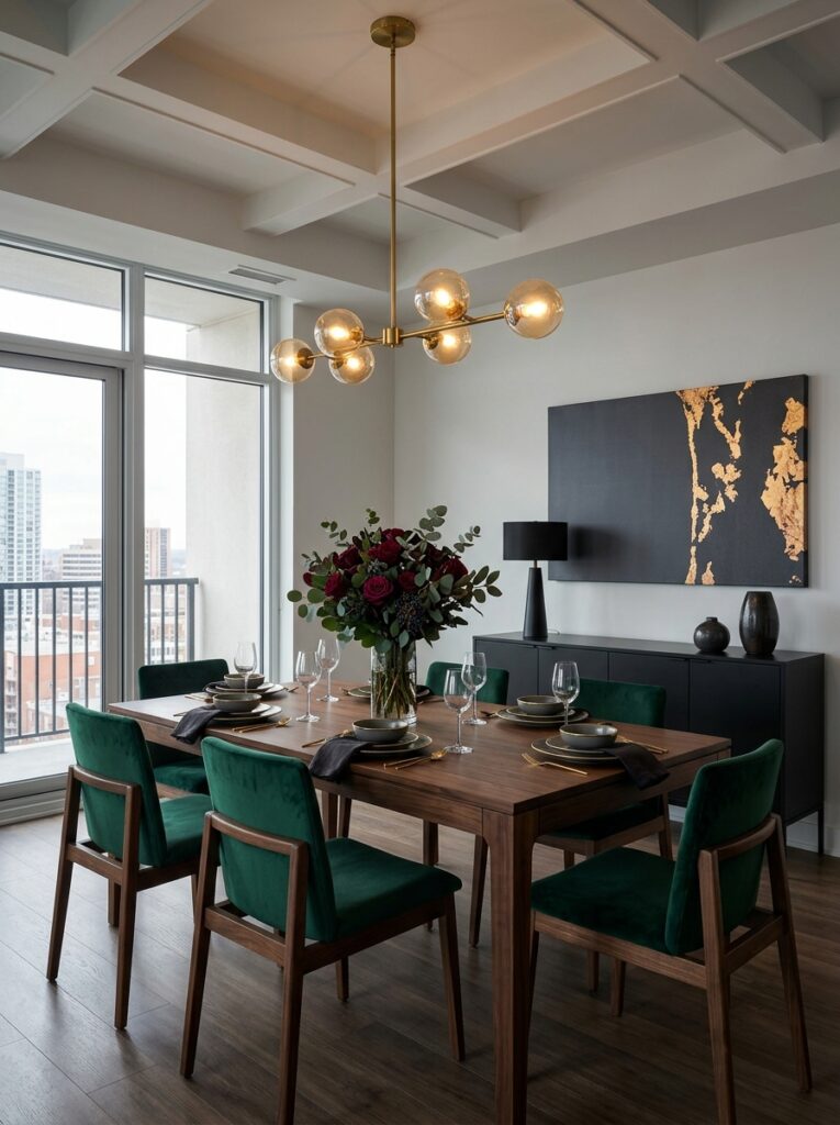
Lighting: The Magic Ingredient
You can have the best colors and textures, but they will fail if your lighting is bad. Harsh, bright white lights create a negative, stressful mood like a hospital or an office. They cause stress and ruin the taste of your food.
For the best appetite design, follow these 3 simple lighting rules:
1. Use Warm Yellow Bulbs
Always buy bulbs that say “Warm White” . This warm light has a positive effect; it makes meat look juicier and vegetables look brighter.
2. The Light Height Rule
Hang your main hanging light exactly 30 to 36 inches above the table surface. This creates a cozy circle of light right on the food, making it the star of the show.
3. Add Candles and Side Lamps
Never rely on just one big light. Light some candles or turn on a small side lamp to create a relaxed, high-end restaurant vibe.
Sounds and Smells: The Final Touch
To truly complete your sensory dining room, you cannot ignore what your ears hear and what your nose smells.
- Bad Noise (Negative): If your room echoes, food tastes less satisfying. Why? Because background noise distracts the brain. Use fabric curtains and soft rugs to absorb sound.
- Good Scents (Positive): Never use strong chemical air fresheners right before dinner. They mix badly with food odors. Instead, use natural scents like cinnamon, vanilla, or citrus oils that naturally welcome guests and open up their appetite.
Want to take your space to the next level? Once you pick the right colors for your appetite, learn how to style the rest of your space with these [7 Home Decor Rules for an Expensive Look] without breaking the bank.
Frequently Asked Questions
What are some easy dining room color ideas for a small space?
If you have a small room, go for soft sage green, warm cream, or light terracotta accents. These colors keep the room feeling bright and open while still creating a cozy, welcoming vibe that is great for eating.
Can I use white or beige if I want a clean modern look?
Yes, absolutely! While white, beige, and cream don’t directly make you hungry, they act like a beautiful blank canvas. They make the vibrant colors of your food—like green vegetables or colorful curries—pop out and look much more delicious.
Why should I avoid bright blue around my dining table?
Yes, absolutely! While white, beige, and cream don’t directly make you hungry, they act like a beautiful blank canvas. They make the vibrant colors of your food—like green vegetables or colorful curries—pop out and look much more delicious.
What is the best lighting layout for a dining area?
Never use harsh, cool white lights. Always choose Warm White bulbs ($2700K$ to $3000K$) and hang your main light exactly 30 to 36 inches above your table surface. This focuses the light right on the food, making your dishes look rich, fresh, and juicier.
Wrap-Up: Use These Dining Room Color Ideas for a Perfect Food Paradise
Your dining room should never be treated as just a place with a table and chairs. Avoid a cold, boring design that kills your appetite. Instead, embrace warm colors, soft fabrics, and beautiful warm lighting to change the way your food tastes. Try these simple tips, and you will see how good design can actually be super delicious!
[…] Discover how environmental psychology extends to your meals with these creative [dining room color ideas that change food flavor]. […]
[…] to refresh your dining space next? Don’t miss our collection of Dining Room Color Ideas for elegant color palettes that add warmth, personality, and style to any […]
[…] If you’re decorating beyond the living room, don’t miss our Dining Room Color Ideas article for timeless paint colors and designer-inspired palettes that create… […]
[…] The right color can completely change your dining room’s mood. Discover these Dining Room Color Ideas for a stylish, welcoming space. […]